Marketing with Displays: Color Theory

The goal of marketing is to entice customers. When marketing is done well, the customer may not even be aware they have been influenced. A predominant way to achieve this is through color theory. According to the psychology of color, people are affected emotionally by different colors and combinations or the connotations associated with those colors. Take "The Power of Color in Jewelry" and make this concept work for your sales by considering display presentations online, in stores or at shows.
While black and white remain classic display colors, the nuances of jewelry presentation are far more varied and complex. When using colored displays, tone on tone isn't always a bad thing; just make sure your pieces don't disappear. If someone walks by your window or booth or browses online and they have to hunt for the jewelry, they are not invested enough yet to take the time to search. Get the attention without having to say a word using these tips based on color theory:
Display Colors
White
Clean, Youth, Absence, Pure

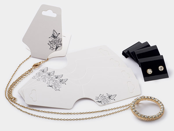
There's a reason most published material is done on a white background. White is often considered a non-color and provides negative space. Black on white looks clean and practical, while pink looks youthful and red looks exciting. There really isn't a color that doesn't work on white. That said, silver can begin to look diminished by white, while gold stands out. Clear is included in this family and tends to go well with most colors.
Grey
Traditional, Serious, Sleek, Balanced

This neutral background pretty much disappears—you guessed it—into the background. Grey is a solid base that redirects attention to bolder colors, especially along the orange to red spectrum. Yellow gold gains new life on grey. Brighter hues look bold and stunning on grey, while paler versions give a softer ambience.
Black
Authority, Sophistication, Elegance, Mysterious, Depth, Gloom
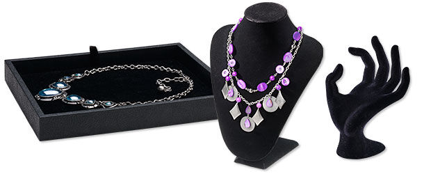
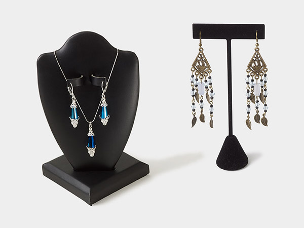
Black is a classic color for displaying all metal tones, especially silver and gold. The dichotomy of light and dark draws your eye to the piece without even realizing what the color is doing. Black with white designs attract attention as poised and authoritative in their sophistication. Black is a good choice for most primary colors, but some grey metal tones such as gunmetal can start to disappear.
Ivory / Cream
Warmth, Mellow, Timeworn
.jpg)
When pure white is too bright, go with ivory, cream or off-white. Ivory-colored displays soften edges, provide a muted, neutral background for earthy palettes and complement gold, rose gold and warm colors like yellow, peach and coral. This color is a gentle contrast on the eyes, rather than the starkness of white or black.
Brown
Solid, Dependable and Earthy
Brown and wooden displays are great for nature-inspired designs and materials including wood, hemp, pearls, etc. White and colors found in nature, such as the spectrum from blue to green, really pop against a brown display. Paired with pink, a color associated with femininity and tenderness, brown becomes a romantic hue. The brown spectrum also includes natural, tan and camel. These are more neutral and direct attention to brighter hues such as purple or turquoise. Deeper browns on these lighter hues look stunning with an earthy appearance that doesn't overwhelm, confident in its practical-yet-understated appeal. Gold looks great on darker hues but may disappear on tans.
Pink
Sweetness, Youth, Romance, Love
.jpg)
.jpg)
Pink is associated with all things romantic and feminine. Pair it with white for a playful and innocent look. Pastels take on a floral or springtime feel when displayed on light pink, whereas black and dark colors pop against brighter shades. Depending on its warmth or coolness, pink looks great with silver or gold tones, but rose gold and copper may blend in too much.
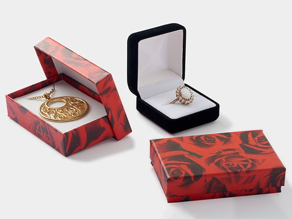
Red
Passion, Boldness, Love, Life, Warning
Both black and white stand out strongly on red, but the message in these two color combos is drastically different. Red is naturally an intense color associated with boldness, while black is one of authority and elegance. Put red and black together for a seductive or powerful tone. White is often a signifier of youth or purity. Pairing red and white adds a more playful appearance, yet still retains a classy look. Blue tends to stand out on red as well—especially handy for patriotic themes.
Green
Nature, Optimism, Growth, Wealth, Luck
Everyone knows red stands out from green, but if you're not doing Christmas sales, it could send the wrong message. Try a similarly bold color instead: orange. This color is associated with energy and ambition or new beginnings. Think of how perfect oranges and peaches look against green foliage. It still offers a natural vibe while adding a little intrigue. Green works with all colors found in nature: green and pink for a floral or feminine appearance; green and brown for a more robust or woodsy look; green and blue for a relaxing, almost tropical, vibe. Natural materials look especially at home on green.
Blue
Tranquility, Honor, Calm
White stands out on a regal blue, maybe even more than it does on black. While black and white are a stark contrast, deep blue is relaxing and white has clean and pure connotations. This combination is not jarring, despite the distinct dark-to-light contrast and instead puts the viewer's eyes at ease. Black and deep hues may disappear on darker blues, so it's best to pick lighter shades. Yellows and oranges are eye-catching against deep blues for a lush presentation.
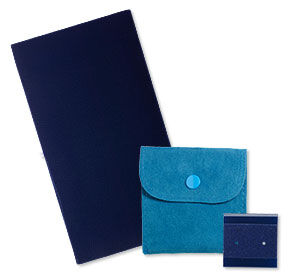
Shop all displays then refine by type and color.
And Remember: Have Fun!
This is the biggest consideration: have fun with what you're doing. Mix some colors other people may not, simply because you like the combination. This color discussion covered some common primary hues, but remember metallic and more exist—explore to find your favorites. Extend your presentation to more than displays, too, with whole settings. Discover more tips in the resources below.
Shop for Your Materials Here:
Have a question regarding this project? Email Customer Service.
Copyright Permissions
All works of authorship (articles, videos, tutorials and other creative works) are from the Fire Mountain Gems and Beads® Collection, and permission to copy is granted for non-commercial educational purposes only. All other reproduction requires written permission. For more information, please email copyrightpermission@firemtn.com.
**Please note that all metaphysical or healing properties listed are collected from various sources. This information is offered as a service and not meant to treat medical conditions. Fire Mountain Gems and Beads® does not guarantee the validity of any of these statements.